This entry was posted on Tuesday, October 14th, 2008 at 10:59 am and is filed under Just for Fun, Online Marketing. You can follow any responses to this entry through the RSS 2.0 feed. You can leave a response, or trackback from your own site.
Top Comment Nonprofits Give Their Web Designers?

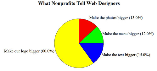
Yes, it’s more fun with graphs, thanks to Katya.
If this made you laugh, you can return a little joy by giving $10 to my fundraiser to fight HIV in the South (Thank you!)
If it didn’t, let’s look at the serious point behind this graph . . . Your website design should focus on your visitors. Making your logo bigger is usually not the best way to improve your visitor experience. Seen any websites with logos that are waaaay too big? Share by leaving a comment.


October 15th, 2008 at 3:30 pm
Fabulous stuff, Kivi. You got special kudos at the carnival here.
October 16th, 2008 at 8:56 pm
I love it. Reminds me of my work in political campaigns 25 years ago. I was told that a campaign needs only 2 billboards: one for the candidate to see on the way to work and one for the candidate to see on the way home.
October 20th, 2008 at 3:24 pm
If you want a logo, photo or text bigger on your website, just tell your users to switch to firefox 3, you can zoom any website as big as you want with it, and it’s free
October 31st, 2008 at 3:04 pm
I had a right old fight to get this through to the organisation I work for, fortunately they’ve now got it and our website is a hell of a lot better because of it! Took me a while and I had to repeat the whole ‘it’s about the users, not the organisation’ thing. If someone has put in your URL or clicked on your organisation after searching Google - chances are they already know your organisation’s name and might have seen your logo. They don’t need it shoved down their necks and the actual content hidden away below the scroll line!