
Matt Higgs
I am loving that so many of you are experimenting with different ways to publish your annual report – and then sharing your stories with us! Matt Higgs of GreenUP in Canada tells us how they decided to do things differently for their 2013 annual report and how they came up with an awesome infographic the community loved. ~Kivi
Guest Post by Matt Higgs of GreenUP
The beginning of a new year is a time welcomed for many. It’s a chance to put the old behind us and look forward to the future. In the not-for-profit world, we continue to dwell on the past for at least the first few weeks of each New Year as annual reports are created and general meetings finalized.
A New Approach
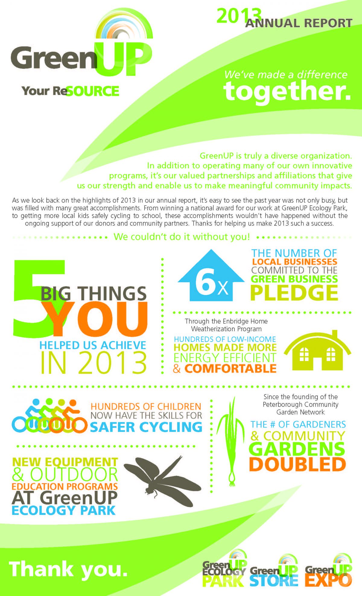
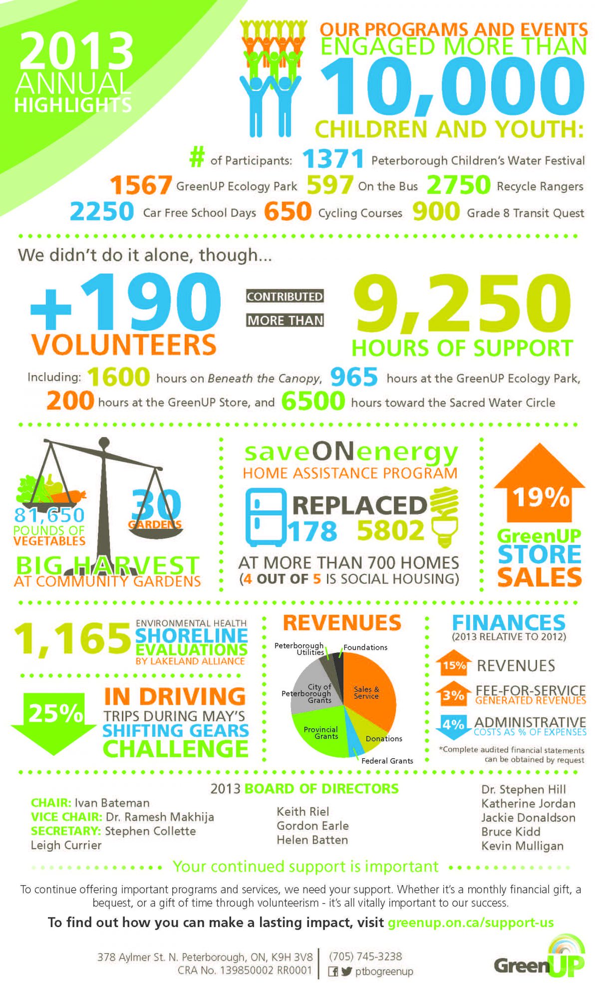
At GreenUP, it’s no different. The task of creating our annual report begins in early February, to be completed in time for our late March Annual General Meeting. The report traditionally was a four page, text-heavy document that involved facts and figures, lists of community partners and compelling photos. This year, however, we decided to do things differently.
Over the past year, the organization went through a rebranding and strategic planning process, the result of which was an increased focus on donor communications. Our previous annual reports consisted of a lot of facts and figures that showed accomplishments, but in a format that wasn’t donor friendly. We realized this had to change for the 2013 report, and wanted a document that not only clearly communicated our accomplishments, but also wouldn’t put the reader to sleep. Enter, the infographic.
Planning
Planning for the report began in early February with an email to staff asking them to begin gathering statistics for their program areas. In the email I asked staff to “think visual” and creatively when it came to gathering stats, and to focus on numbers that reflected accomplishments. To assist with explaining the concept, and to help tailor some of the information provided to me, I printed off several examples of infographics developed by other non-profits and posted them in an office common area.
Design
After the initial data was gathered from staff (I allowed about three weeks for this), I vetted it and added in some ideas of my own before shipping it off to our graphic designer. GreenUP is exceptionally fortunate to have a staff member who does graphic design work on the side. Without question, having a graphic designer with solid knowledge of your organization will benefit the outcome of your report.
A week later, the first draft of the report was delivered to my inbox. I allowed three days for revisions, mostly due to a tight printing deadline to have the report back in time for the AGM. After some slight changes, the report was sent off the printers and was in our hands within a couple days.
Community Reaction
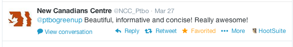
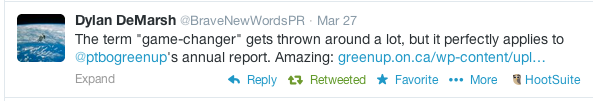
The feedback we got in response to the report was amazing. Several non-profits in the city tweeted and shared our example with others. We received comments on social media saying it was a “game-changer” and “beautiful, informative and concise!” There’s no doubt in my mind that others in the community will adopt this format of reporting.
Going forward
Beyond the Annual Report, we’ve been able to use the infographics in other communications to keep the momentum going. They’ve appeared on our website, in a newspaper ad and in social media as a quick and effective way to communicate our accomplishments from the past year.
We couldn’t be happier with the inforgraphic format. It’s allowed us to clearly and concisely narrate the major successes from the year prior, convey the importance of donors and community partners and do it in a format that was easy to digest. We’ll be definitely be using this format in the years ahead.
GreenUP is a small, non-profit environmental organization located in Peterborough, Ontario. Matt Higgs, Communications and Marketing Specialist, has been with the organization since 2008, sharing the passionate work of GreenUP staff throughout central Ontario.

