Cindy Olnick
If you are curious about how other nonprofits handle branding and graphic design, join us Thursday, October 20th for our latest Nonprofit Q&A Panel. Today’s guest post is by one of the panelists, Cindy Olnick. ~Kristina
Guest Post by Cindy Olnick of the Los Angeles Conservancy
After thirty-five years, the Los Angeles Conservancy got its first graphic identity system in 2013. We’d had the same logo since 1982, but we’d never had a formal, cohesive expression of our brand.
We jumped on the chance to change that as part of a broader effort to redevelop our website. You can read about the updated logo and identity system on our website; here I’ll share some pointers on how we got it done.
The project included three phases of graphic design work: the logo itself (which we’d either update or replace), identity materials (letterhead, business cards, etc.), and tool kit (style guide, templates). The logo design was by far the most time consuming and collaborative phase since it set the tone for everything to follow.
The Team
We worked with the talented design firm YYES, whose co-founder is a Conservancy member. That’s not why they got the job, but it certainly helped that they truly understood and supported our mission of preserving historic places.
Working closely with my boss (our president and CEO), I served as project manager—assembling the team, coordinating all input and review, translating between the designers and stakeholders, and making sure we finished on time and within budget.
We identified our stakeholders for the project as primarily internal: staff, board members, and volunteers. Like any group of humans, these smart, passionate people have a diverse range of perspectives and opinions. How could we harness this valuable input into tangible success without losing our minds?
Mantra #1: This Is Not a Democracy
Knowing that design by committee is, as one designer put it, “difficult and neutering,” my boss and I appointed ourselves as the ultimate decision makers. To build consensus and foster meaningful participation by our stakeholders, we:
- Surveyed all staff and board members, as well as selected past board members, current volunteer leaders, and younger volunteers.
- Created a smaller advisory group of selected board members and senior staff for periodic updates and input, not direct decision-making.
- Gave updates at bi-weekly staff meetings and quarterly board meetings, keeping the process transparent while gaining broader input and approval on key decisions.
Mantra #2: This Is Not Personal
People love playing with graphics and colors. It’s fun. We wanted to have fun with this project—and we did—but we had to be crystal clear about the outcome. If we left the logo up to our personal tastes, we’d never be able to agree on one. We’re simply too different. I reinforced the fact—early and often—that our logo embodied the Conservancy’s mission, not our preferences.
We also agreed that our logo was not a Swiss Army Knife. It would never be able to illustrate every facet of our work. A successful logo would conceptually express, simply and clearly, the Conservancy’s connection to historic architecture, preservation, and Los Angeles as a whole.
Over several months, the designers gave a series of presentations, from high-level concepts down to the final product. I spent a lot of time synthesizing feedback, sending summaries to stakeholders, and following up on specific decisions. I sent a LOT of emails. Long ones, with lots of bullet points. But I found them invaluable in managing expectations, building consensus, and keeping us moving forward.
We ultimately decided to update our logo rather than replace it, in a nod to continuity (given our mission) and in recognition of the strength of our established brand. We also created logos for our signature programs, such as walking tours, to give them their own flavor while keeping them firmly in the Conservancy family. The designers rounded out the system with around twenty illustrated icons of L.A. architecture, as well as graphical patterns in several colors from our new palette.
The identity system included stationery, note cards featuring selected icons, a style guide, and templates in InDesign and Word for in-house documents. We bought a couple of fonts for InDesign but also specified two standard fonts for the Word templates, so that any staff member could use them without special training or software.
Going Public
We introduced the new identity system in June 2013 with the launch of the new website. Two weeks later, our member newsletter featured several articles on the new site, logo, and identity system. We explained it on the site for returning visitors, announced it in our monthly E-News, and posted it on social media.
With so many longtime members heavily invested in the organization, we expected some negative feedback. I think we received one comment to the effect of, “I like the old one better.” Yet the rollout was surprisingly smooth and the logo well received. Our brand identity continues to serve us well three years later, lending a bright, modern look to our efforts to preserve the best of our past.
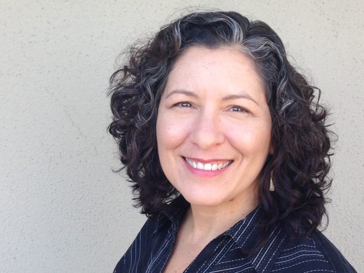
Cindy Olnick is Director of Communications for the Los Angeles Conservancy, the country’s largest local historic preservation organization. She joined the staff in 2004 as the Conservancy’s first communications professional and now oversees a department of four. A native of Columbus, Georgia, Cindy worked in corporate communications in Cambridge, MA and managed internal communications for the Harvard Business School MBA Program before moving to L.A. in 2000. She lives with her husband and cat in the Mt. Washington neighborhood of Los Angeles.
Cindy will be talking more about their re-branding efforts as well as taking your questions October 20th at 1:00 p.m. Eastern (10:00 a.m. Pacific) during our next Nonprofit Q&A Panel: Branding and Graphic Design.
She will be joined by Amalia Lynn Howard, Media Coordinator at ServLife International Inc. talking about the basics of color, composition, and typography in design and Julia Reich, Branding Consultant and Graphic Designer for Stone Soup Creative sharing insights and best practices on working with an outside graphic designer.

![10 Types of Video Content Your Nonprofit Should Be Creating [With Examples]](https://www.nonprofitmarketingguide.com/wp-content/uploads/2023/04/african-guy-recording-new-video-blog-on-digital-ca-2022-04-27-03-24-00-utc-2-500x383.jpg)


