
Sarah Lougheed-Gill is the director of admissions & communications at Walden School, a progressive independent school for grades pre-kindergarten – sixth in Pasadena, California.
Sarah recently went through our communications director mentoring program and shared the changes her school made to their email newsletter as well as the feedback she got from the parents at her school. We thought it was a great story, and Sarah agreed to let us share it with you on the blog.
Here is what she said about the old newsletter:
Our Thursday newsletter goes to all current parents at our school. It is a push page template that had recently evolved to have fresh content in the top banner (this example shows school pajamas on sale) and in the bottom left box (this example shows a Board member with her family, talking about why she serves on the Board. We were soliciting new Board members at this time of year).
Our Director likes to write a weekly note (we call it his “e-cover”) and then there was a list of announcements from all different constituents. This was dense copy and difficult to read easily on a phone screen.
See for yourself:
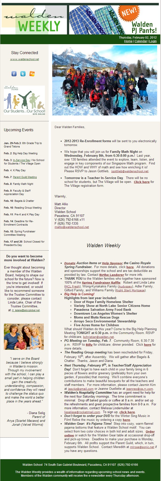
As you can see, there is nothing really of note for the reader’s eye to catch. While they do use bullet points and bold text to try to highlight certain points, it’s still entirely too text heavy and not skimmable at all. Some of the links are very close together which would make it tough on mobile users to tap.
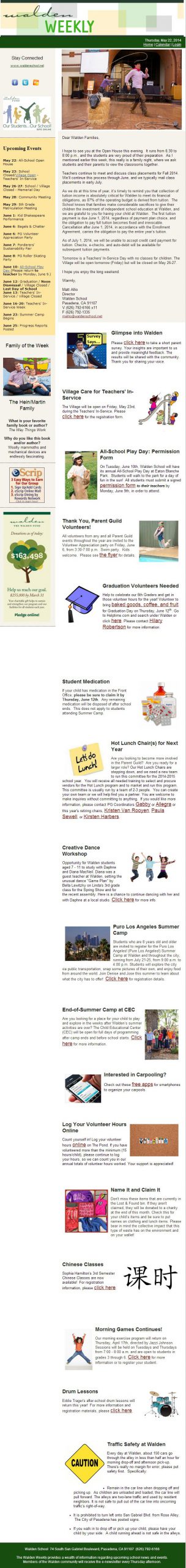
Sarah realized this was an issue and redesigned the layout adding more white space, images, and less text.
It’s still pretty long for an email newsletter, but it’s definitely easier to read. And it’s hard to argue with happy parents and an increased open rate. As Sarah said of the new design:
We have received tons of compliments and gratitude from our parents who like the new template better. And our open/click thru rates are consistently higher than with the former template.
Here is the updated design:
What might the next evolution of the newsletter include?
I’m recommending that nonprofits move to single columns and be consistent about how photos and text are justified (all photos to the right, or all to the left). It’s just that much easier for the eye to skim quickly without bouncing back and forth.
How about your e-newsletter? Have a before and after you’d like to share?


