
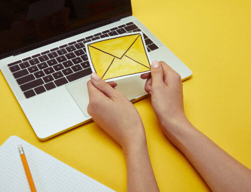
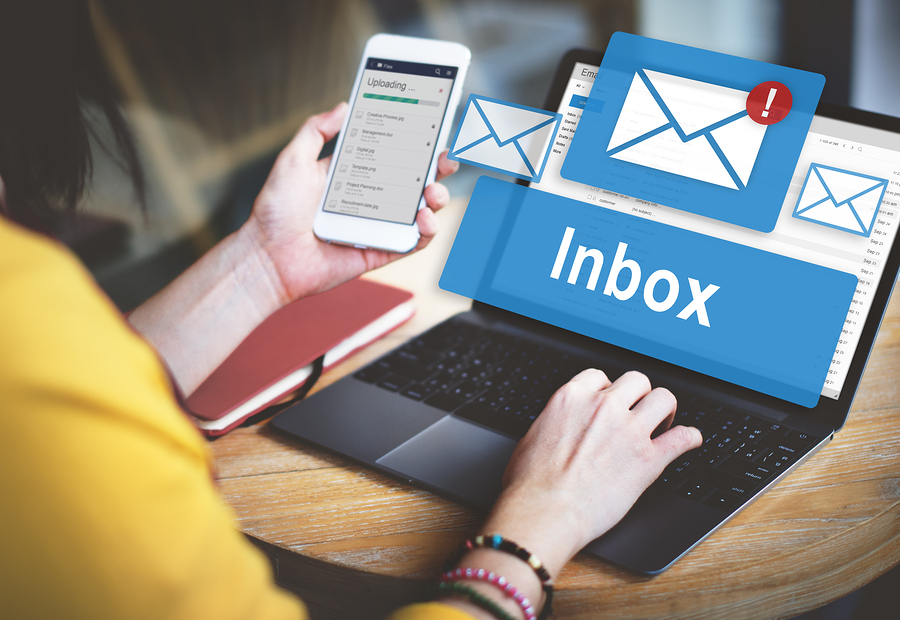
At the end of September, we redesigned our weekly email newsletter to include more white space and smaller blocks of text. It’s a sleeker look that’s much easier to read (or just skim) on both desktops and mobile devices.
After we sent the redesigned newsletter, we heard from several of our subscribers who liked the new look including Jeanine Marlow at Cornerstone Prep who mentioned her school had just recently redesigned their newsletter as well.
I asked Jeanine to share the before and afters for you, and here is what she had to say:
We send out one for our elementary families and one for secondary. They are chock full of info each week. The one from March [below] is before the redesign. We used multi-colored blocks, our text was centered, and we included way too much text. We use MailChimp for all our newsletters.
Here is their old newsletter:
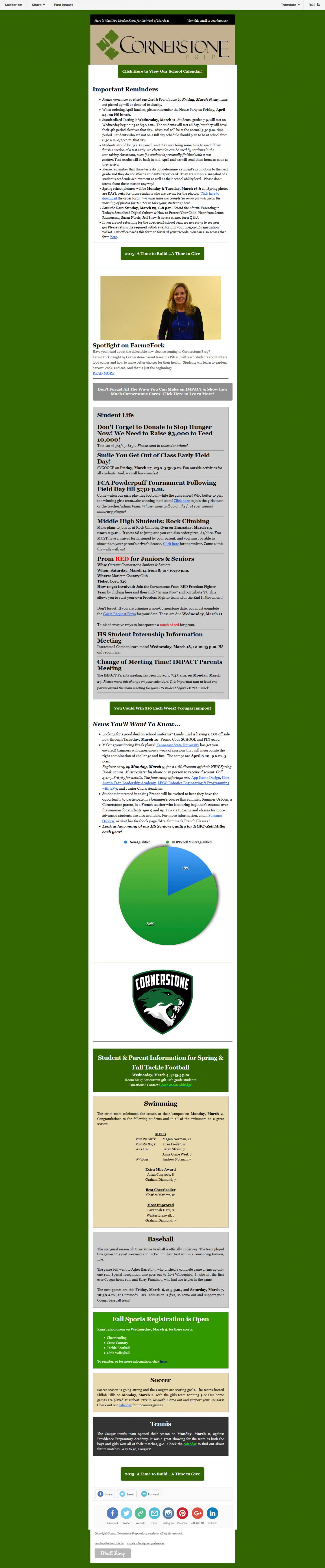
Email newsletter before the redesign.
Next Jeanine explained how they changed their newsletter:
Over the summer, I redesigned based on input I had picked up from Kivi and other blogs. I cut out most of the multi-colored blocks, moved all the text to be left justified and really cut back on the amount of text by adding links. I knew from our analytics that over 60% of our parents were reading our newsletter on their mobile device. So, I wanted to make it as mobile friendly as possible.
After Kivi sent out her redesign, I did add using links in my sub-headers, which I think really helped. Most of our links link back to our school blog, which I then repost throughout the week in more “bite-size” pieces via Buffer on our social media channels. I’m open to suggestions to ways to make them more reader friendly, but do think we have come a long ways–thanks to Kivi!
Here is the updated version:
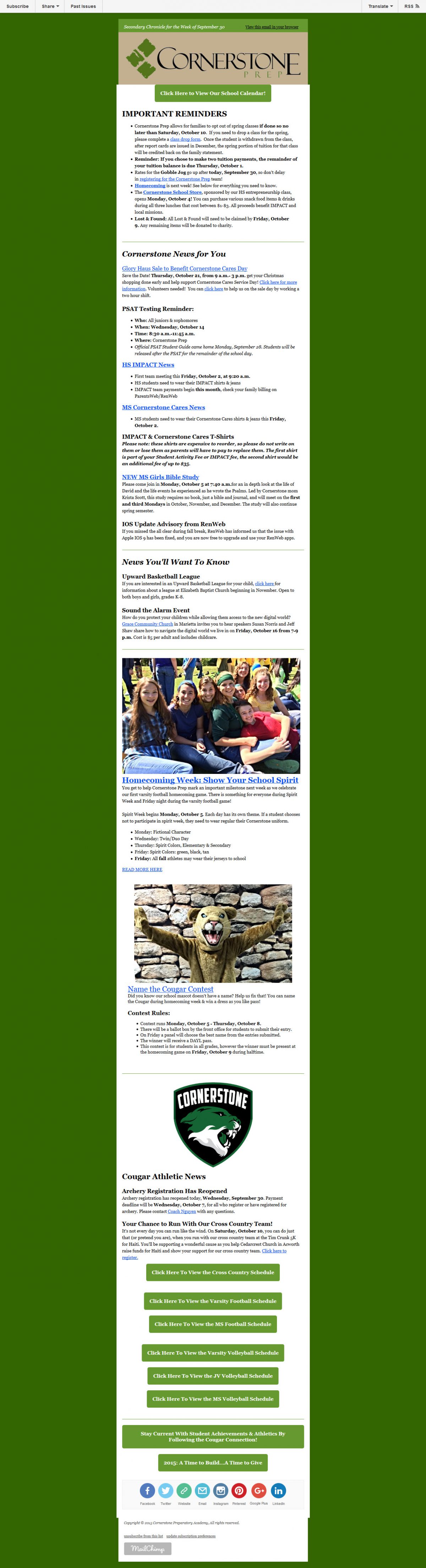
Email Newsletter after the redesign.
It’s Kristina here again . . . It’s definitely an improvement over the mismatched color blocks and heavy text blocks. I would include even more white space, especially in the first section, and perhaps link to one central landing page for the sports’ schedules instead of including a button for each one.
It’s still a long email, but as a parent I can understand the need to include a lot of information. Perhaps creating a few different newsletters focusing on a particular topic such as student life or athletics could help.
Do you have any suggestions for Jeanine at Cornerstone? Share them in the comments below!