

Abby Jarvis
Last week, Abby Jarvis finished her two-part series on marketing strategies to drive donors to your donation pages. Today, she starts another two-part series on how to avoid common mistakes on your donation forms. ~Kristina
Guest Post by Abby Jarvis of Qgiv
We all slip up from time to time. Whether it’s dropping a bowl of chips on the floor or accidentally wearing two different shoes to work, mistakes and blunders happen to even the best of us.
A snack slip-up or a fashion faux pas is one thing. Your nonprofit’s online donation form is quite another.
You see it all the time–donation forms that either:
- Aren’t aesthetically pleasing, or
- Don’t work correctly.
However, online giving is rising fast, along with donors’ expectations for what donation pages should look like and how they should work.
Don’t drive your donors away with a lackluster or malfunctioning donation page.
We’ve compiled a list of the top 7 mistakes that nonprofits make on their donation form. We’ll be talking about how you can fix those errors by:
- Making a good first impression.
- Keeping donor data safe.
- Not requiring too much info.
- Keeping donors on a single page.
- Including recurring donations.
- Not forcing donors to make an account.
- Maintaining consistent branding.
Make sure that you’re sidestepping these common donation form mistakes.
And follow these 20 best practices for a stellar donation page.
Today we’ll cover the first 4 mistakes.
Mistake #1: Not Making a Good First Impression.
As previously stated on this very blog, “You have less than 25 seconds to make a good impression on first-time visitors to your website.”
What is true for your website, in general, is also true for your online donation form.
Your donation page should be visually appealing.
It should draw donors in.
It should make them want to stay and finish the donation process.
What does making a good first impression mean, though?
Well, it means that your donation page should:
- Be easy to find.
- Incorporate a single image.
- Include only relevant text.
Let’s look at each of these separately:
Be easy to find
We’ll get this point out of the way early: your donors can’t give to your organization if they can’t find your online donation form.
Donating shouldn’t be a game of “Where’s Waldo?”.
Therefore, you need to make your donation page easy to find by:
- Promoting it in your donor communications.
Include a link to your donation form in your emailed newsletters and your social media posts. Mention it at your in-person meetings. Place the URL somewhere on your direct mail communications. Get the word out.
- Featuring a “Donate Now” button across your website.
A donor who arrives on your homepage for the first time should be able to donate just as easily as someone who checks your blog every week for updates.
Putting your donation page out there requires active promotion if you truly want to start raising more money online.
Incorporate a single image
You’ve heard it time and time again: “A picture is worth a thousand words.”
Whether you think the saying is trite or true, one thing is certain: images play a huge role in creating emotionally- and aesthetically-appealing donation forms.
If you want to create a good first impression, include a single image at the top of your donation form that demonstrates the people, animals, or communities that you serve.
Let’s take a look at an example:
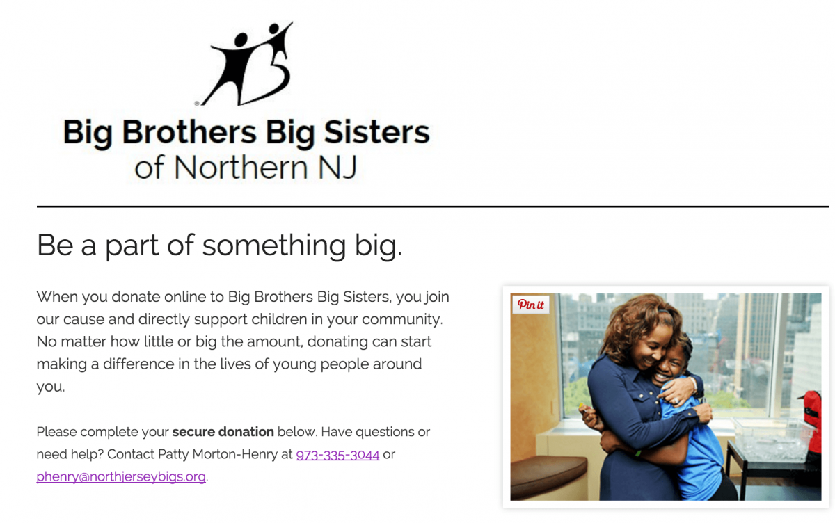
The Big Brothers Big Sisters chapter of Northern New Jersey includes a happy image at the top of their form to remind donors of why they’re giving. This is the first thing supporters see when they land on the donation page, and it’s a perfect way to encourage them to continue with the donation process.
If you want to make a good first impression, include a powerful and positive image at the top of your donation form.
Include only relevant text
Think about meeting someone for the first time. It’s no fun if only one person is doing all the talking, is it?
The same principle goes for your nonprofit’s online donation form.
If the top of your donation form is as long as the first three chapters of War and Peace, you’ve missed the mark.
Instead, keep it short and sweet. Tell supporters what they need to know and then let them get on with donating.
If donors want to know more about your organization, they’ll do so by:
- Visiting your blog;
- Signing up for your newsletter;
- Checking out your social media sites;
- And more.
The text on your donation form should be relevant to the donation process.
If we look back at the BBBS chapter of Northern New Jersey’s donation form, we’ll see that the text is emotionally appealing and reminds donors why they should give.
They also include contact information if donors have questions (this component can be optional).
Bottom line: Make a good first impression by making your donation page easy to find and incorporating only relevant text and images.
Mistake #2: Not Keeping Donor Data Safe
One of the most egregious mistakes that nonprofits make when it comes to an online donation page is not keeping their supporters’ data safe.
Your donors’ privacy and security should be your top priority.
In order to reassure donors that their data is safe, make sure you maintain PCI DSS (Payment Card Industry Data Security Standards) compliance. If you don’t stick to the standards, you not only risk your donors’ data, but you might even face fines.
You can let your donors know that your form is secure by placing security logos and certifications on the page.
Donors can give with peace of mind, and your organization won’t be putting their information (or yourself!) at risk.
Bottom line: Maintain PCI DSS compliance to keep your donors’ data safe and limit your own liability.
Mistake #3: Requiring Too Much Info
Online giving is supposed to be quick. It’s supposed to be easy.
It’s not meant to overwhelm or misguide donors.
Your donation form should only require basic information from your supporters. If they have to fill out a lengthy survey just to donate $25 to your organization, they are likely to give up and close the tab.
Extra requirements only inconvenience donors and slow down the donation process.
If you need to collect information from donors, do so in your regular communications with them. The only information you should require on a donation page should be relevant to the donation process.
Bottom line: Don’t hinder the donation process by requiring donors to fill out an abundance of information.
Mistake #4: Guiding Donors to More Than One Page
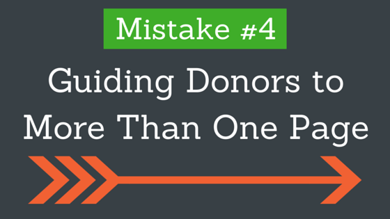
This point goes hand-in-hand with the previous one.
Donors don’t want to go through several screens just to hit the “Donate Now” button.
Instead, simplify the donation process and keep everything on the same page.
If you want to see increased conversion rates and revenue per visit, you should keep donors on one page during the donation process.
Why do one-page donation forms work best?
Well, think of it as a day spent running errands. Would you rather go to several shops to get all of your necessities or go somewhere that has it all?
If you’re looking for efficiency, you’d likely choose the latter option.
Same goes for your donation page. If donors have to jump through hoops just to get to the final step, they’re less likely to actually complete the process.
Bottom line: Keep your donors on a single donation form to increase conversion rates and, potentially, donations.
Join us next week for Part 2!
Abby Jarvis is a blogger, marketer, and communications coordinator for Qgiv, an online fundraising service provider. When she’s not working at Qgiv, Abby can usually be found working on freelance writing projects or binge-watching sci-fi shows on Netflix.


