
Back in February, I told you how we had started to segment our email list according to engagement levels, and how we had been sending our weekly e-newsletter in four batches:
- Hot (5 flames in our lead scoring tool within our CRM),
- Warm (3-4 flames)
- Lukewarm (1-2 flames)
- Cool (0 flames — even though they score zero, they are still engaged in some small way or they wouldn’t be on the newsletter list at all anymore).
Back then, newsletter sends to our Hot segment, which was about 25% of our email list, had an average open rate of 64%! The average for the Warm segment (about 21% of our list) was 30% — still very good.
Would these great open rates hold over time?
We wanted to know that answer too, so I’ve analyzed the data again for the period from April 1 – July 1, or 14 weeks.
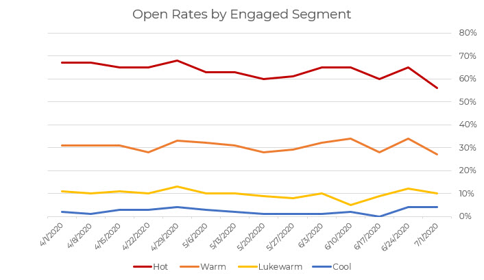
As you can see, this chart is very similar to the one shared in February. These lists are dynamic, meaning they change daily based on the lead scores that each person in the database has.
As we reported last time, about 46% of our list falls into the Hot/Warm segments combined. That remains true today.
Why does this matter?
This tells us a few things . . . mainly that our email marketing and engagement program as a whole is stable.
About half of our mailing list at any given time is highly engaged, with open rates of 64% for the Hot group and 31% for the Warm group. We can count on people in those groups to consistently open our emails. The other groups, not so much.
Given this sustained pattern, I am less interested in the open rates of any individual email. It makes more sense for us to focus on
- Growing the list while maintaining these proportions between engagement level, and/or
- Trying to move more of the 54% at Lukewarm/Cold to the Warm/Hot side of the equation.
How might you apply what I’ve talked about here to your own email marketing strategy? I’d love to hear what you think.


