

Peter Panepento
If you have been reading our blog the last year, you will probably recognize Peter Panepento. Peter is the principal at Panepento Strategies, a full-service content, digital, and social strategy firm for nonprofits and socially-minded companies. He was formerly an assistant managing editor at The Chronicle of Philanthropy as well.
We are excited to announce that he has officially joined our team of advisers along with Kerri Karvetski and Nancy Schwartz. Peter will be blogging and presenting webinars for our All-Access Pass Holders on how to get media attention for your organization. Welcome, Peter! ~Kristina
As someone who earns a living largely through the written word, I’m about to make a difficult admission.
When you’re pitching a story to the media, words aren’t enough.
There, I said it.
This shouldn’t be a startling statement. After all, I don’t think it should surprise anyone who works in nonprofit communications that strong photos and videos are essential to getting attention.
But when nonprofits reach out to the media, it’s amazing how many of them rely solely on written materials to pitch their stories.
While a well-written release with a grabby headline and a juicy news hook might have been enough to get reporters to pick up the phone a decade ago, that’s not the case anymore.
In today’s environment, when competition for media attention is more fierce than ever and many media organizations are looking for ready-made content, you need something more.
Your written message needs to get amplified with visuals. Otherwise, all of the time you spend crafting that release is likely to be wasted.
But don’t just take my word for it.
News releases that are accompanied by a single visual asset — such as a photo, logo or infographic — are 92 percent more likely to be seen online than a simple text release, according to an analysis by PR Newswire, which distributes content to the media on behalf of companies and nonprofits.
And the more visuals you have, the better those numbers get.
Those that include multiple media elements outpace text releases by more than 5.5 times.
Despite those numbers, though, PR Newswire found that 86 percent of the news releases published on its platform don’t include visual elements.
These numbers point to a great opportunity. By simply adding some smart visual elements to your next release, you will dramatically increase your odds of having your release get seen.
What’s more, not only will you get seen, you might also get a leg up on getting your news picked up by the media.
With budgets shrinking in many newsrooms, reporters and editors are actually looking for opportunities to get free visuals to accompany their stories. Not only do you stand a better chance of getting coverage, you also have a greater chance of getting your photo or graphic published in the newspaper or on a website.
This isn’t just true if you’re trying to get placement on a new media website like Buzzfeed or Upworthy. My former employer, The Chronicle of Philanthropy, doesn’t have a staff photographer. A little-known secret in the nonprofit world is that The Chronicle relies heavily on submitted photos — and nonprofits that have compelling photography of their work and programs have a stronger chance than most in getting into its pages.
The challenge, of course, is that compelling visuals don’t just fall out of the sky. That’s why 86 percent of those PR Newswire releases are text only.
But there are a few things nonprofits can do to incorporate strong photos, graphics, and videos into their media-relations efforts.
Take a step back
It sounds simple, but it’s important to think about visuals whenever you plan a new announcement, campaign, or event. And you need to start that thinking at the very beginning of the process.
If you’re producing a new report, is there are graphic that you can generate to help show the key findings? If you’re planning a new campaign, are there photos or videos that you can use or develop to help tell your story?
If you put off asking these basic questions until the end of your process, your visuals will become an afterthought.
Show your work
Your nonprofit’s work is interesting. Show it off!
Instead of taking grip-and-grin photos of people posing at your fundraising dinner or donors presenting your executive director with a big check, find a talented volunteer who might be willing to take pictures of your team in action — or of beneficiaries who have changed because of your organization’s work.
If you have data that shows your impact — or demonstrates the need for your programs — take time to develop simple graphics that help tell those stories.
In time, you should be able to build a library of interesting images that you can use in conjunction with your pitches and releases.
Use what’s free
While I strongly recommend investing in photography and videography (or finding talented volunteers or supporters to chronicle your work), there are also a number of no-cost ways to find compelling photos.
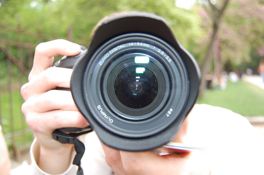
The photo-sharing site Flickr has a rich library of Creative Commons licensed photos, many of which you can use with nothing more than attribution. The photo that accompanies this post (taken by a photographer named Thibault Martin-Lagardette) shows the quality of images that are available.
New photo resources seem to be coming online every day — including this great new image library from the New York Public Library.
Explore graphics
For nonprofits that are looking to create graphics on a budget, there are a number of free online tools that will help you build clean, easy-to-read charts and tables.
Canva, Piktochart, and Dipity are just a few of the examples of no-cost tools that will help you get started.
photo by: Thibault Martin-Lagardette/Flickr
![12 Things You Can Stop Doing Right Now [Infographic]](https://www.nonprofitmarketingguide.com/wp-content/uploads/2025/01/Stop-Doing-2025-Info-hung-up-500x383.png)

