I’m in the middle of developing a marketing strategy, including a website revamp, for a local food bank. As part of any strategy process, I like to take a look at what other similar organizations are doing, so I’ve perused the websites of dozens of small food banks across the U.S.
What food banks do is really not that complicated from a communications perspective: one group of people works to get food to another group of people. The best food bank websites keep it that simple!
My Favorite Food Bank Websites Lead with Simple Stories and Ways to Help
On these websites, you’ll see lots of volunteers who are collecting, sorting, preparing and delivering food. Or you’ll see grateful clients receiving the food. The website navigation is very action-oriented (e.g. donate, volunteer, get food).
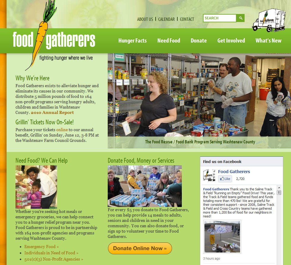
Food Gatherers in Michigan does a nice job with this approach to their website, focusing on volunteers with their imagery. You see “Need Food” and “Donate” in several places.
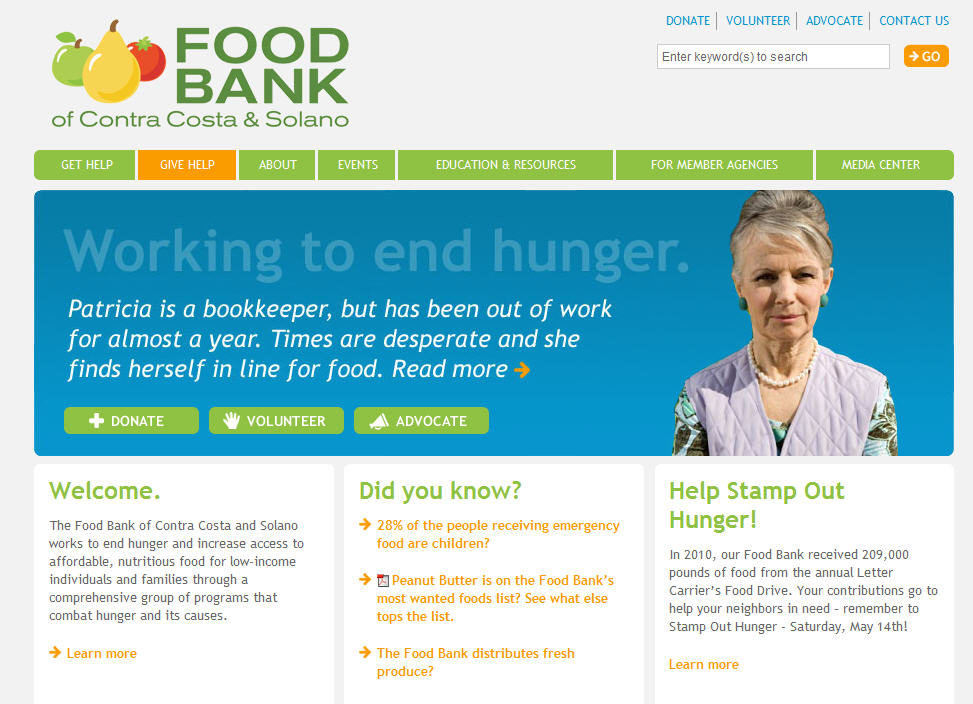
The Food Bank of Contra Costa and Solano in California does a nice job too, but with imagery of their clients. They do include some stats on the home page, but in a clear, simple way.
Beware of Too Many Stats, Generalities, and Events
Of course, not every food bank takes this approach.
I also saw several websites that were more focused on public education and programs. They try to make the case for support by reciting a bunch of statistics and describing the problem in that generic nonprofit language like “The problem of hunger in our community is far greater than most people realize. Now, more than ever, your help is needed.” Blah, blah, blah. If any nonprofit down the street could use the same language by replacing just one word, what you are saying is too generic.
They also use a lot of jargon and programmatic language on their home pages and in their site navigation like The Growth of Food Insecurity, Raising Awareness about Hunger, Childhood Hunger Programs. This kind of language speaks more to those who work in nutrition or social services than to the people who are most likely to need assistance or to volunteer. I’d much rather see a menu item called “Food for Children” than “Childhood Hunger Programs.”
I also saw quite a few food bank website home pages that were dominated, if not overwhelmed, by event marketing. It’s wonderful that food banks have so many different national partners who want to help them, but when a local group’s website home page is essentially taken over by logos for the USPS Letter Carriers Food Drive, The Biggest Loser Pound for Pound Challenge, and their own local food drives, it’s easy for site visitors to lose the emotional connection with the cause. Promote these partnerships, but not to the exclusion of your core messages.
What I’m Recommending to My Client
I’ll recommend to my food bank client that their website keep it simple with a few stories, while centering on the actions we want people to take.


