Guest Post by Julia Reich of Julia Reich Design
Introduction
Charts. Graphs. Spreadsheets. Most organizations have important data to present to their clients, members, boards of directors, and other audiences. Yet we live in a world where we are bombarded with information, where our attention spans get shorter and shorter. Who has time to read, or understand, the charts and diagrams created by your overworked staff?
Infographics are a communication trend that illustrate data in an attractive, easily digestible format.
With their unique combination of images and words, infographics are a powerful storytelling tool. It’s a way to take all that stuff you’ve collected about the great things your organization does, and make it exciting. Use infographics to illustrate timelines, histories, relationships, the impact of a program or service, and much more.
Removing a Barrier to Understanding
Infographics have been around in the private sector for a while now, with NPOs lately jumping on the bandwagon. They resonate with nonprofits for a number of reasons, the first being that they make complex ideas easily understandable, allowing your audiences to learn and connect with you.
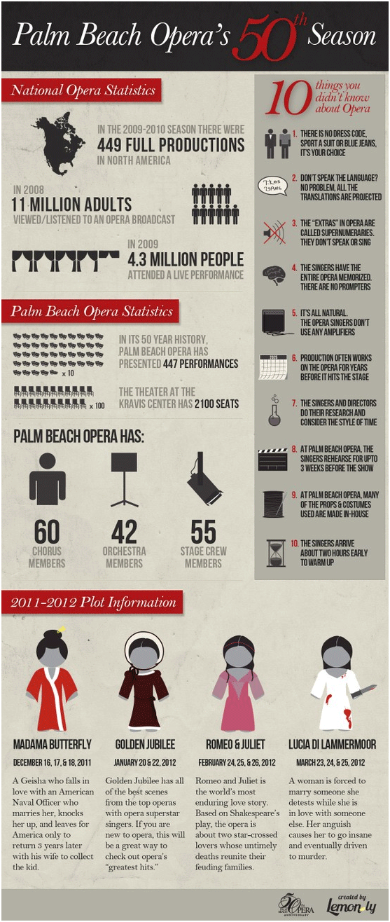
Ceci Dadisman, the Director of Marketing & Public Relations at Palm Beach Opera in West Palm Beach, FL, used an infographic for the first time recently to promote her group’s 50th Anniversary Season. She says, “Opera, ballet, and symphony are such complicated art forms. We are always trying to explain it simply in a nonthreatening way. Infographics are a good way to explain what opera is with some facts anyone could understand.”
Done clearly and intelligently, they can not only be an efficient way to convey information, they can also help create an emotional connection.
Jeff Ferzoco should know. As the Creative & Technology Director at Regional Plan Association in NYC – an 85-year old advocacy group focused on urban research and planning in the tri-state area – it’s his team’s job to sift through mountains of data on a daily basis, and figure out the best way to arm his audience of policy-makers and citizens with the knowledge they need to move the conversation forward about a particular project. “Busy people don’t want to spend too much time to unravel complicated information, so if it’s explained at a level that’s instantly understandable and emotionally satisfying, you’ll have a lot more success getting your message across. It’s removing a barrier to understanding,” he says.
Secondly, as an online creature, infographics are easily share-able and therefore inherently social media-friendly. In turn, this can boost your SEO efforts. In the case of Palm Beach Opera, the graphic was initially hosted at visual.ly – an infographic portfolio site – on the PBO blog, and also via Facebook, Twitter and email, always with a link to the infographic when the 50th anniversary season was mentioned.
Coming next: Using infographics as part of your marketing toolkit, with examples and ideas on how and where to use them.
Julia Reich is principal of Julia Reich Design, which helps nonprofit organizations bring their mission to life with award-winning brand strategy, graphic design, and web design services. Clients love her team’s top-notch creative work combined with an affordable, personalized approach.


![10 Types of Video Content Your Nonprofit Should Be Creating [With Examples]](https://www.nonprofitmarketingguide.com/wp-content/uploads/2023/04/african-guy-recording-new-video-blog-on-digital-ca-2022-04-27-03-24-00-utc-2-500x383.jpg)


