Thinking of creating a new logo this year? We’ve got a list of what will be hot for 2013. While the examples given are from businesses, we think nonprofits will still find it useful. We are big fans of MOO! ~Kivi
Guest Post by Simon Goble of MOO
As we enter a new creative year, many businesses (and nonprofits) will attempt a rebrand to reflect their new brand values and to attract themselves to a new consumer base. However, we at MOO notice that certain trends in these rebrands occur year upon year. Join us as we predict 2013’s trends for logo and identity design.
1. Minimalistic brands
With business giants Microsoft and Ebay revealing ultra-minimal, typographic-based identities at the end of this year, we expect to see more brands deciding to take on a much more ‘grown-up’, slick, contemporary identity in 2013. Emphasis is placed on strong typography and a less is more approach to design.
2. Geometric
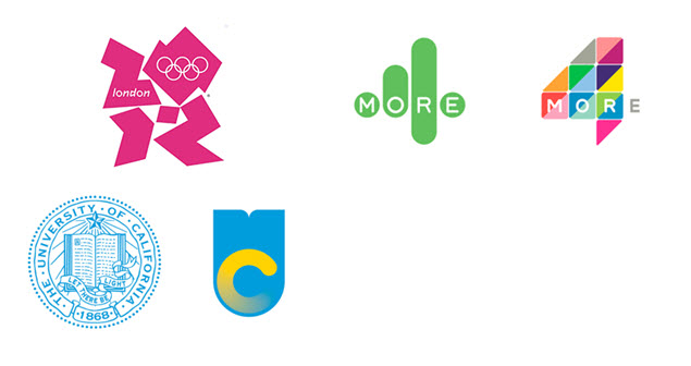
With the controversial redesign of University of California, we’ve noticed a trend for the geometric in the latter half of 2012. Who could forget the love it or hate it logo for London 2012? With its sharp 1980s lines and triangular look, we expect other brands to take inspiration from this unusual logo. We predict simple shape logos and bold patterns alongside geometric typefaces such as Gotham and Futura.
3. Handmade/ Vintage
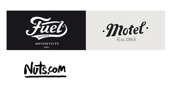
Despite being the 21st Century, many brands this year decided to go back in time to an older era! This trend is defined with elaborate hand drawn type, handwriting inspired typography or handmade, crafty design elements with textured papers, off whites and retro inspired design elements. Also expect to see nods to traditional print processes such as letterpress and stamps and imitations of splashed watercolour and paint in 2013.
4. Heritage
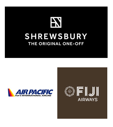
Following on from the handmade and vintage trends, this trend takes an alternative route by looking back at historical heritage and proudly claiming it for the entire world to see. The identity for Shrewsbury town, designed by agency We All Need Words shows the true feel of this trend, taking the iconic Tudor patterns of its buildings and echoing it on their brand material. With Air Pacific rebranding their business to Fiji Airways and exploring the tribal history of its country in its beautiful new identity, expect brands to turn to the past in 2013.
5. Multiple/building block logos
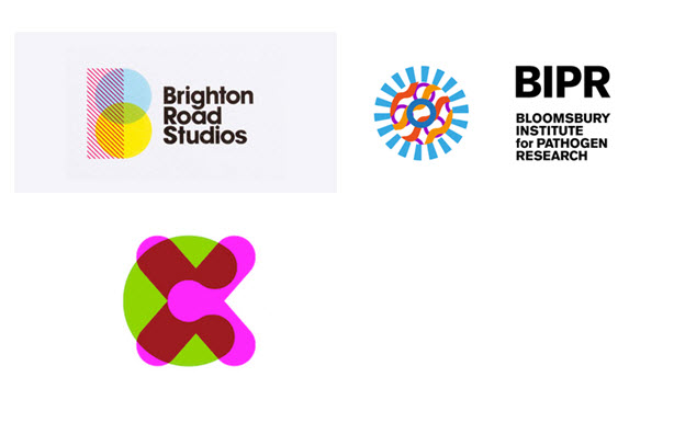
Who said a brand needed one logo? Many businesses are taking a multiple logo approach to their new identity strategies. These ‘building block’ logos are made up of a combination of two or more separate logo elements laid on top of each other. We expect more businesses to adopt this flexible style of identity in the New Year.
6. Coming together
A clearly evident trend of 2011, we’re still noticing brands employing the coming together of design elements in their branding. Expect to see logos made up of all sorts of icons in 2013 promoting a more social and friendly brand, be them simple coloured dots or overlapping geometric shapes. Businesses showing off this trend are Orange and T-Mobile’s collective venture EE, the new brand identity for Cancer Research UK and B2B mobile commerce business, Weve.
7. Distortion and manipulation
The award-winning rebranding of news channel Current.TV in 2011 employed an unusual undulating flag that was distorted wherever it was printed. Brands are expected to use similar bold black and white logos that are distorted in every way possible. Also expect animated GIFs to be prevalent in this trend demonstrating the distortions, showing that logos don’t always need to be static.
8. Party-time!
With the next Summer Olympics being held in the party capital of the world, Rio in 2016, an innovative logo was announced made up of chunks bright vibrant colour and movement. Many logo solutions are now taking on a similar appearance with near kaleidoscopic colour variation and fun curved letterforms.
9. The Anti Brand
One for the brave; this branding trend claims no brand at all! This rebellious anti design approach requires no logos; typographical system or distinguishing marks and is a creative explosion of different sometimes conflicting design ideas. Expect to see more independent businesses and startups taking this approach to their identity in the New Year rather than the larger, more established brands.
Are there any trends that we missed? Let us know in the comments!
Simon Goble works for print and design company moo.com. MOO print business cards, greeting cards, stickers and much more. Visit them at us.moo.com


